MUNDI
We have identified inconsistent user behaviors on the platform, along with direct inquiries to the customer service team. Additionally, we've observed customer and user churn without understanding the underlying reasons. This indicates the presence of friction or barriers affecting the user experience on our platform.
Product discovery
Research
Factoring
B2B
Asigned role
Sr. Product Designer
Team
1 UX Designer + 1 UX Content
1 Product Manager
1 Technical Leader + 4 Developers
Timeline
Jun. 2022 - Aug. 2022 // 8 weeks
Tools
Let's star the journey with some information

Pain points
We mapped user-reported errors, analyzing friction points not just in the UI but also in the storytelling. This holistic approach uncovered the "why" behind the user experience issues – both visual interface problems and shortcomings in the narrative flow of the presented information. By going beyond the pixel, we pinpointed the root causes and developed user-centered solutions with a higher chance of success.

UX Plan: Optimizing the factoring user journey
Gather insights from CS (Customer Support) + Mouseflow.
Identify productive flows related to Factoring.
Understand how different sections are interconnected (or not).
Determine the purpose of each of the current sections.
Analyze current information and its relationships.
Suggest small improvements and test hypotheses.
Concentrate on a single section for focused analysis.
Benchmarking
Customer Dashboard (Desktop)
Interaction Design
Interdisciplinary Collaboration
Information Architecture
Product Strategy
Prototyping Tools
Storytelling
Team talk (Presentation)
Usability Testing
User Flow Design
User Research
Visual Design Principles
Wireframing
8
MINUTES
The average time spent navigating between sections in search of the required info.
1 out of 3
USERS
finds the Factoring sections confusing. The functionality of each section is not clear.
Invoices
TO PAY
83% of users do not understand which invoices they have to pay.


These are screenshots of the platform prior to our intervention.
Based on the information gathered from Mouseflow, customer complaints received by CX, and the analysis conducted, the section that presented the most confusion was the "Granted Advances" section. Users accessed this section to request new advances rather than to review those they had already obtained. They struggled to understand what was being presented to them.
🟣 Iterate on information hierarchy: Clarify how information is presented.
🟣 Use clearer labels related to payment status: Overdue / Due soon.
🟣 Provide a history of transactions related to the specific advance.
🟣 Modify wordings to be more explicit about the information being provided.
🟣 Transform the section from purely informational to actionable: Provide actions related to their advances.


Statement of account
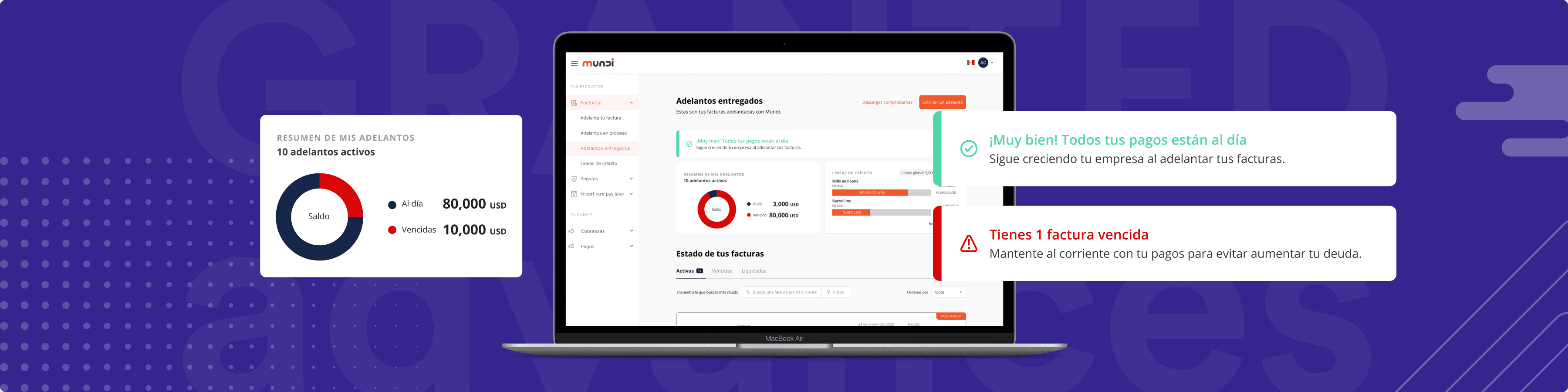
The statement of account is unclear to the user. They don't have a clear understanding of whether they owe money or not until they check each of the advances or tabs. The information provided in the header is confusing and not very helpful.
Goal: To provide simple and clear information about the user's account status, without using complicated numbers.

On the left: Current experience. On the right: The sketches progressed gradually based on the feedback received.


At the forefront, we present the user's account status: whether they owe or not. We display relevant figures, such as the total advanced and available credit lines. Sections are seamlessly interconnected without forced transitions. To aid comprehension, we graphically represent the advance status, eliminating the need for users to process multiple numbers simultaneously.
Cards
Users struggle to understand how much they need to pay for an invoice and want to be able to relate a specific invoice to a payment made. Additionally, they mention not receiving a payment receipt (Disbursement). Lastly, they express the need to comprehend the total amount paid for an invoice, including interests and additional costs.
Goals:
To present users with details about payment movements associated with advances.
To provide users with the necessary information about granted advances.

Currently, while the cards contain relevant information for the user, we notice that everything is under the same hierarchy of importance.

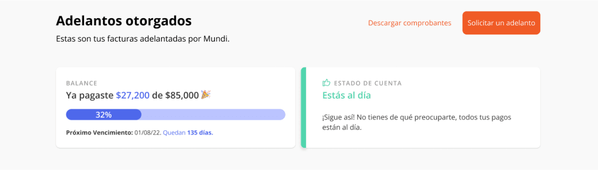
The prototype
We developed a prototype to gather feedback from various users. This prototype has allowed us to obtain valuable insights into users' experience with our solution, identifying aspects they find useful, problematic, and suggesting improvements.
Among the feedback received, the following stand out:
Users noted that it is now much clearer how much they owe. In response to this feedback, we further simplified the graph.
Additionally, we added information about lines of credit with higher availability, which was well received by users.

Final thoughts
This project has been an enriching journey filled with valuable lessons. I've gained a deeper appreciation for the power of data visualization in enhancing user experience and making complex information more accessible. It has also reinforced the importance of collaboration and effective communication in achieving project goals.
I want to extend my sincere appreciation and gratitude to my content partner, César López, for his outstanding support and collaboration on this project. César showcased remarkable adaptability and made significant contributions as a UX writer. I am truly thankful for his dedication and valuable input throughout the project. Thank you very much!
Data Visualization
Information Architecture
UI
Usability Test
Prototyping Tools

