MUNDI
Untangling a confusing account statement to help users understand exactly what they owe.

Product Discovery
UX Research
Overview
Mundi's platform showed inconsistent user behaviors, recurring inquiries to customer support, and unexplained churn — all signs of friction somewhere in the experience. A combined analysis of Mouseflow data and customer support feedback pointed to the Granted Advances section as the main source of confusion: users went there expecting to request new advances, not to review existing ones, and struggled to understand what the section was showing them.
Client
Mundi
Duration
8 weeks
Asigned role
Sr. Product Designer
Industry
Factoring
Year
2022


Goal
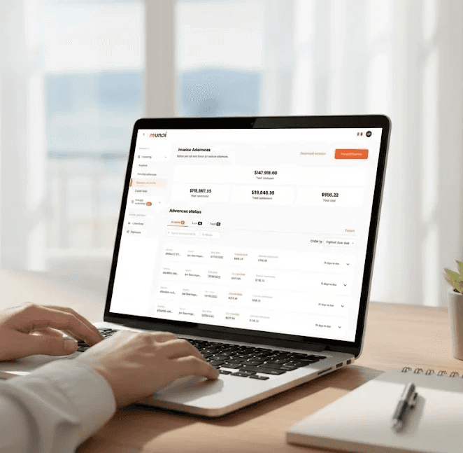
Clarify the Granted Advances section so users could immediately understand their account status — what they owed, what was due soon, and what credit was available — without having to cross-reference multiple tabs or numbers.
Process
The team started with a UX plan combining input from customer support and Mouseflow analytics to map productive flows, understand how sections connected to each other, and identify the purpose of each one.
This research showed that users spent an average of 8 minutes navigating between sections looking for information, that 1 in 3 users found the Factoring sections confusing, and that 83% didn't understand which invoices they needed to pay.
Based on these findings, I focused on the Granted Advances section and worked closely with a UX content partner to iterate on information hierarchy, clearer payment-status labels (Overdue / Due soon), transaction history, and more explicit wording — shifting the section from purely informational to actionable.


Solution
The redesigned account statement puts the user's overall status front and center — whether they owe money or not — alongside key figures like total amount advanced and available credit lines, with sections flowing into each other without forced transitions.

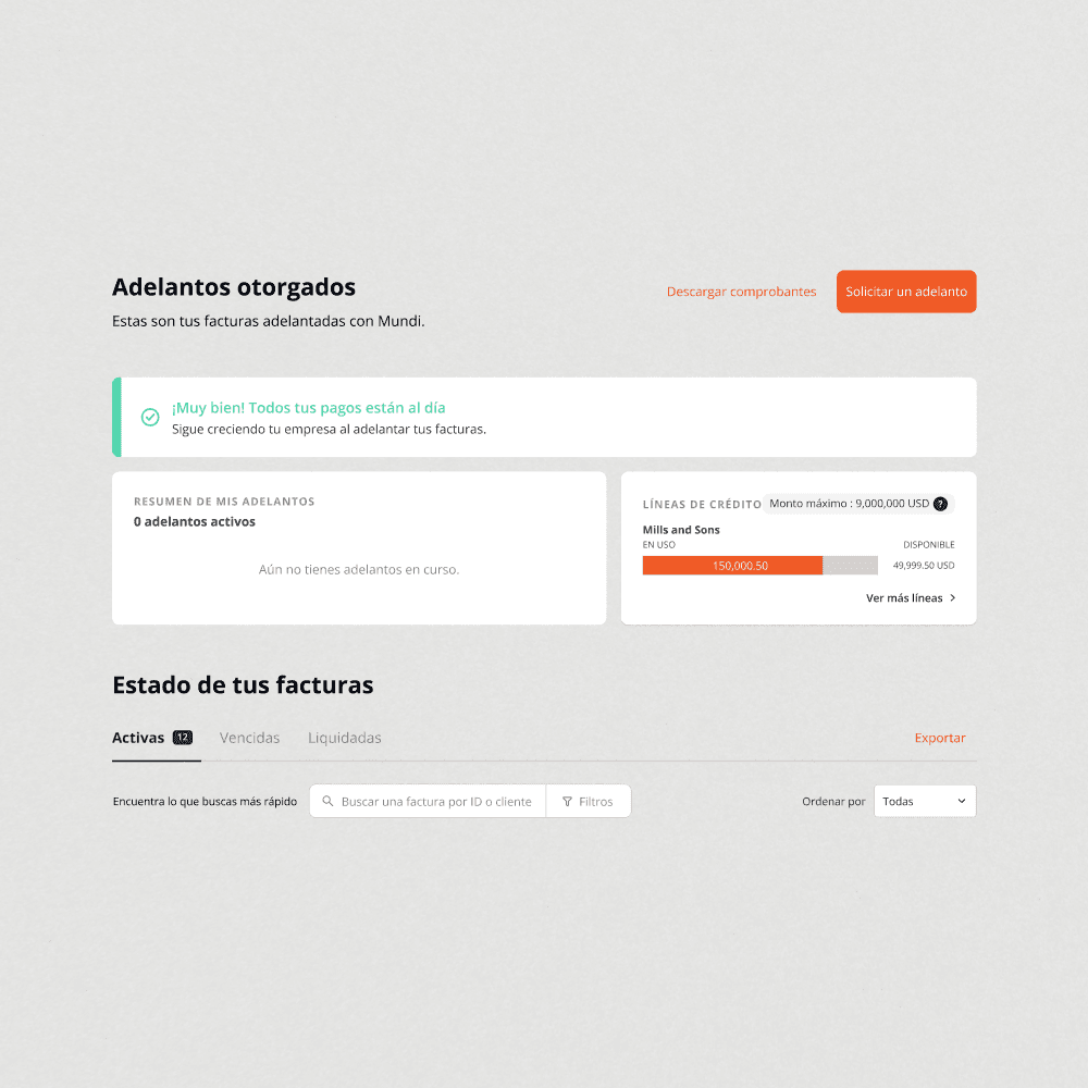
A graphical representation of advance status replaced multiple raw numbers, making it easier to grasp at a glance.


The advance cards were restructured to establish a clear hierarchy between payment movements, granted advance details, and disbursement information.


A prototype was tested with users to validate these changes before rollout.
Impact
User testing confirmed the core problem was solved: users said it was now much clearer how much they owed, prompting a further simplification of the graph based on that feedback. The added visibility into credit lines with higher availability was also well received, addressing a need users hadn't explicitly asked for but responded positively to.
Reflection
This project deepened my appreciation for how much data visualization can do to make complex information accessible. I want to give special thanks to my content partner, César López, whose adaptability and UX writing made a real difference to this project — it wouldn't have come together the same way without him.