MERCADO PAGO
Building a collaborative design system to help a fast-growing business unit scale without losing consistency.

UI Library
Insurtech
Overview
Insurtech is a business unit within Mercado Pago focused on expanding Mercado Libre's financial services through digital insurance products, built so users can resolve claims entirely from the app.
As Insurtech grew from a small team to roughly 15 designers and 150 developers within a year, the unit had no shared place for standard UI components, leading to perceptual and functional inconsistencies across products as new features shipped quickly.
Client
Mercado Pago
Duration
8 weeks
Asigned role
Mid. UX Designer
Industry
Fintech
Year
2022
Goal
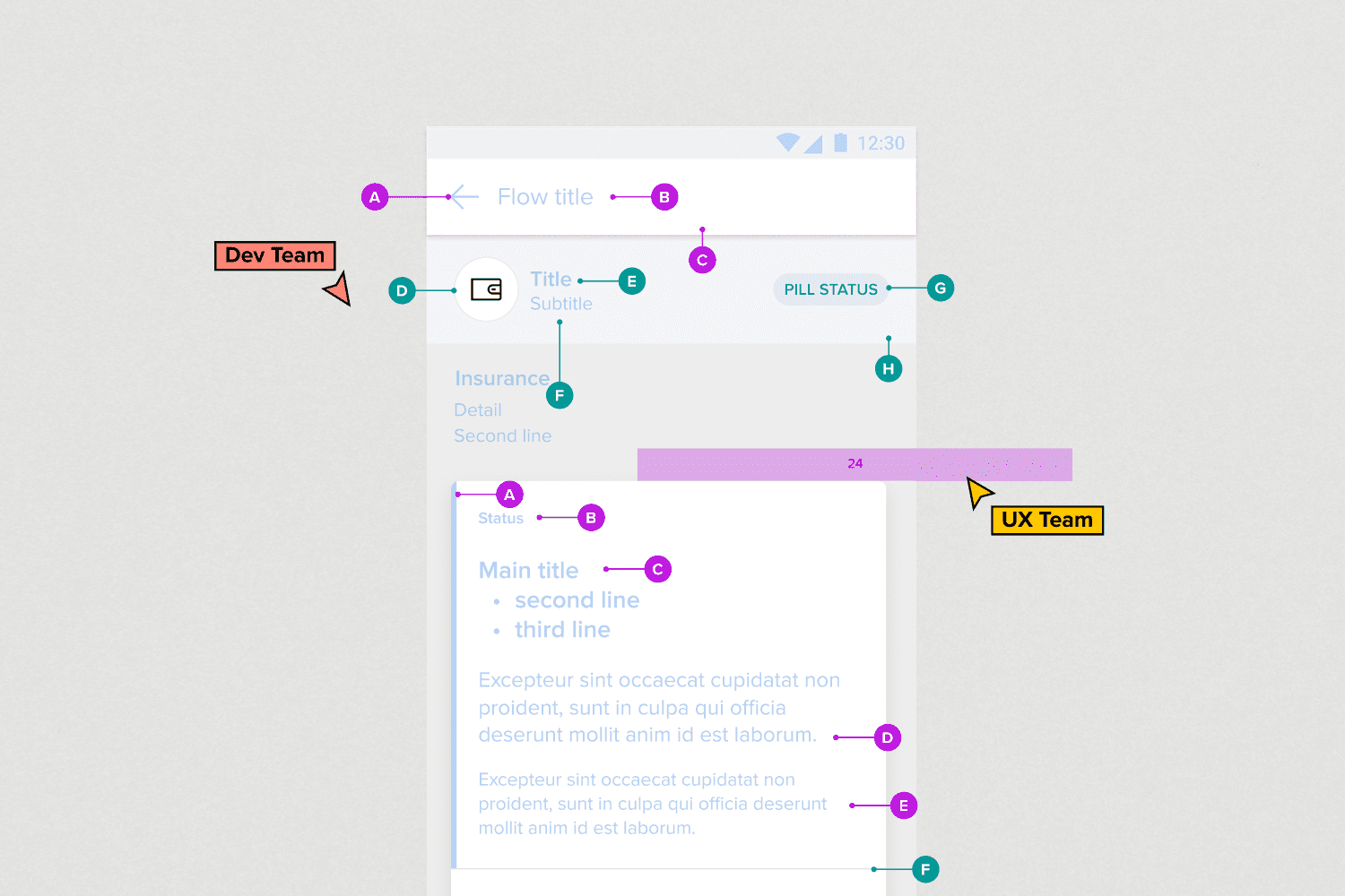
Help the UX and development teams work together to create simple, scalable, and consistent experiences, by establishing a design system, producing high-fidelity component specs, and aligning closely with Mercado Libre's existing Andes library.
Process
I started with research across the team, auditing the components used in cross-product administration to identify what was outdated, inconsistent, or missing, and to decide what to keep, redesign, or build from scratch.
I then connected with the Andes team — Mercado Libre's primary design system — to understand where Insurtech's components diverged from it and where there was room to align. Based on these findings, I helped redefine the scope and roadmap for the initiative, renegotiating delivery timelines and the shape of the final deliverable.
Throughout, I worked closely with the development team to standardize module names, set up weekly check-ins, and understand both developer and designer needs, with the product team providing usage data on existing components.

Solution
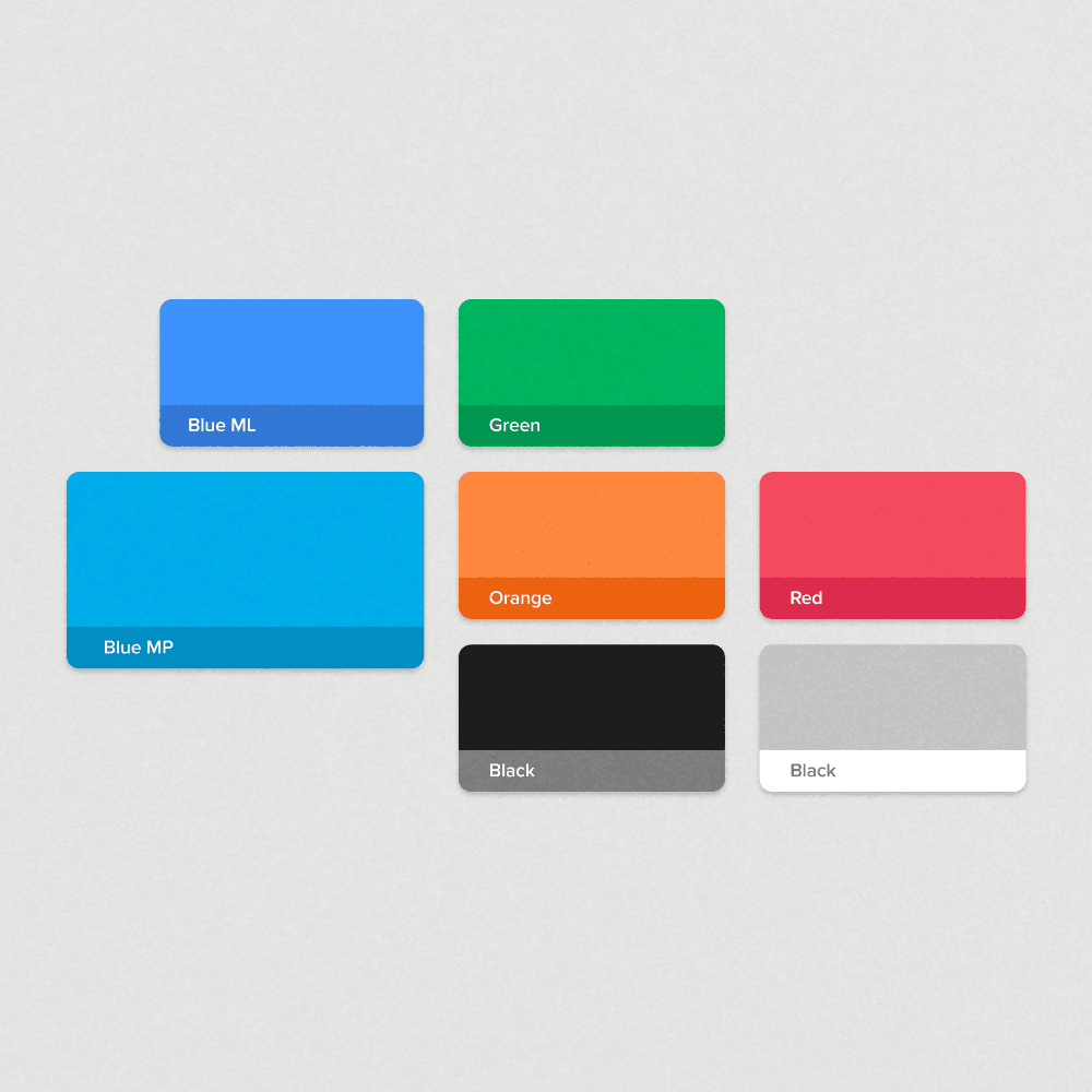
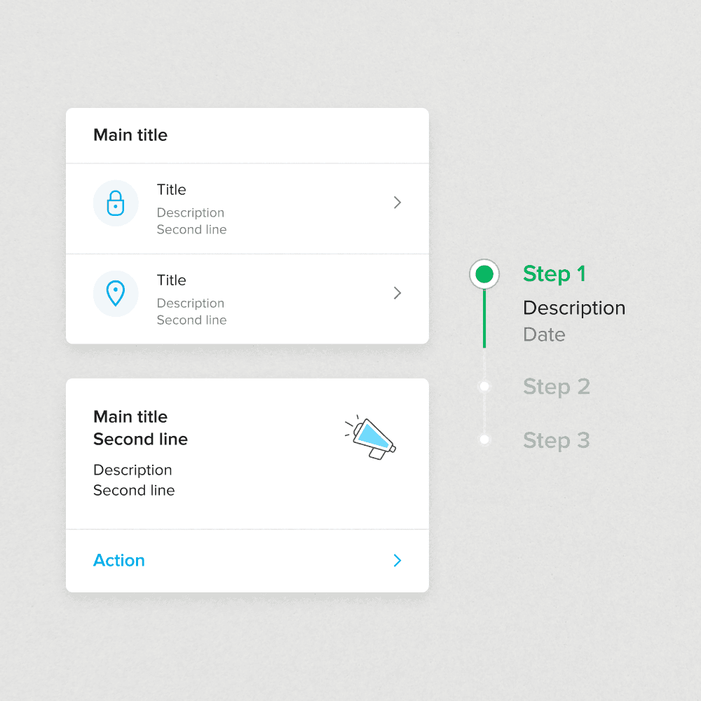
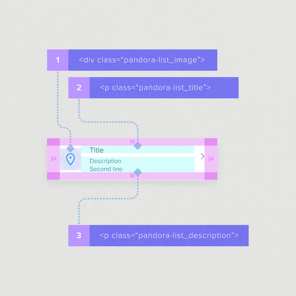
The result was Pandora: a design system built on Andes' foundations (colors, typography, layout, and spacing), with components specified in Figma by the UX team and mirrored in a GitHub Storybook by the development team for testing.

Beyond the component library itself, Pandora included detailed specs covering padding, margins, element arrangement, variables, and usage guidelines — turning loose conventions into a documented, shared reference.

Rolling it out also meant presenting it internally, including a UX session shared with designers from other departments across the company.

A prototype was tested with users to validate these changes before rollout.
Impact
Pandora became the shared foundation for Insurtech's UX and development workflow, used by 16 people across content and design and adopted by a development team of more than 150 across the front-end and back-end. It supported 3 active products that together drove over 800,000 sales in a single year, and was later featured as a notable Andes sub-system at Figma's Config event in 2022.
Reflection
Pandora was my first independent project at Insurtech, and it remains one I'm especially proud of — it pushed me to really dig into design systems and Figma in ways I hadn't before. More than that, it's where I built some of my closest working relationships with developers, and I'm grateful to Marcela Cardoso, Diego Reyneri, and Leonardo Baraldi for their support along the way, as well as the whole development team for making the collaboration so smooth.